Creating a web application without a pre-planned layout prototype is very much like trying to explain a complex route to a blind person. Of course, the interface cannot exist without content, but the reverse statement is also equally important. For many popular applications, the design has become a key element of success.
In this case, it is not so much about the color and modernity of the design, but about the functionality and navigation accessible to beginners, which is equally simple on both desktop and mobile versions of the web application. The fact that, today, there are a lot of different devices that can be used to access the internet, is a great comfort for the end user but creates a lot of complications for developers. After all, the business logic behind coding correctly is only half the deal. The notable share of the software development process is devoted to the user interface, in particular. one that would automatically adjust to an arbitrary screen resolution and, at the same time, maintain unconditional usability. With the spreading of mobile platforms such as iOS and Android and internet capable devices such as smartphones and tablets, the issue of providing a comfortable user experience becomes ubiquitous. This leads to the idea of designing responsive websites.
In this article, we will study this topic in greater detail. In addition, we will provide a number of responsive web design best practices, which help to modify web applications to work with absolutely any format of a custom gadget. So, how do you design a responsive website? Let’s begin with the definition of this concept.
What is Responsive Design for Websites?
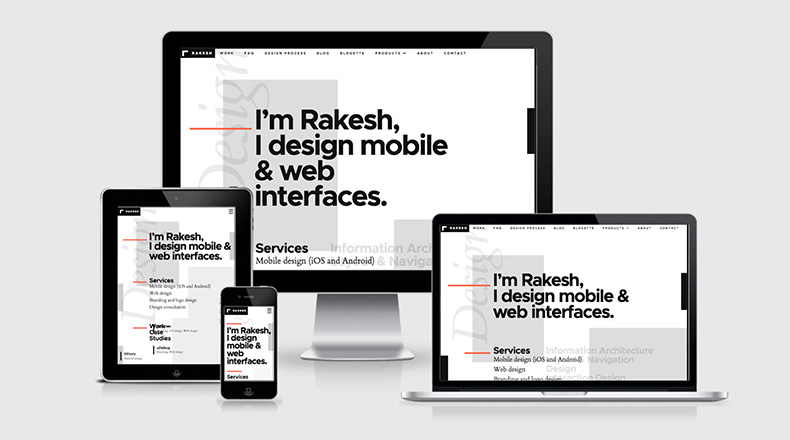
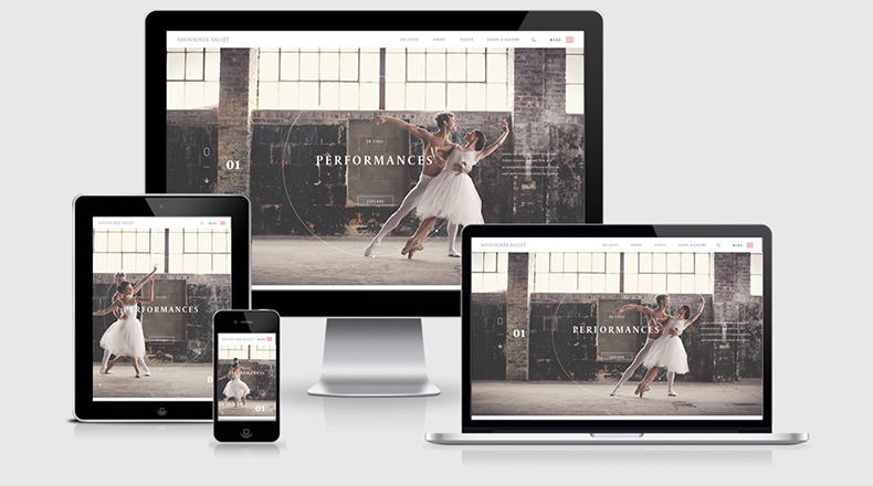
The term was coined by Ethan Marcotte, who proposed that websites and web applications be presented in a "flexible" format that would automatically adjust to any resolution on users' gadgets. Such a radical proposal was not due alone to a whim of the renowned web designer. One can simply look at the statistics to understand how fast the number of users of mobile gadgets is growing and how much new innovations can be in demand. Impressed? If not, just take a look at these responsive website design examples separately with your smartphone, tablet and PC/laptop:
https://newadventuresconf.com/2019/
Fourteen Tips for Responsive Web Design
Below, we will provide responsive design tips and tricks which, when practiced during the application creation process, will make the app automatically adjust to any screen format while upholding the same usability between devices.
1. Align all the Elements to the Scalable Grid
Responsive website design is most clearly characterized by the term “Grid System.” When implementing it, each interface element of a site or application is tied to a certain grid; that is, their dimensions depend not on the defined number of pixels, but on a certain scale. This characteristic should be mandatory for any of your software solutions because, otherwise, users of your software are likely to encounter the fact that some elements will simply be invisible on small screens. So, you’ve decided to orient an application to a grid. Is it really that simple? Well, it will not be particularly problematic if you do not use textured borders or gradients, and the transition from one tint to the other is done horizontally. Note that the latter option is still possible with some new features in CSS3; however, this will not help if some of your users do not use browsers with the appropriate capabilities.
2. Consider the Proportions
When creating a scalable solution for a web application, do not abuse the usage of window width parameters. This is fraught with the fact that, when you run your software on a device with small dimensions, the elements located along the edges of the browser can be cropped out. Let us provide an example. Headings the size of 100 points will be visible on the desktop of your PC but do not exactly fit into some smaller Android displays. In order to settle this aspect, you need to find out which fonts should be presented in the static version, and which ones will be dynamically adjusted to the display format. As a rule, containers with text fall into the first category. The second one includes headers, button inscriptions, labels, etc. Separately, we must note that some novice web designers allow a rather coarse error, indicating not the relationship between height and width for individual components, but the actual difference of these values (for example, the width is less than the height by 30 points). This is not right. As a result of scaling, such an element is likely to skew. Do you want to avoid these problems? Then do it right and use relative values - for example, the height is 1.4 times the width.
3. Apply Different Styles to the Application, Depending on the Resolution
Have you heard of Media Queries? These are extremely useful tools, devised by CSS creators, which help to represent components depending on the size and aspect of the visible window. With Media Queries, you can find out the current screen resolution and adapt the application pages to these settings, applying predefined styles, if needed. What do you need to start using this tool? It’s simple - you need to divide the entire interface of your web application into a number of fundamental frames, such as main content, sidebar, title, navigation, etc.
4. Pay attention to navigation
When creating a design for the navigation menu, try to maximally discard strings in favor of informative icons. This does not mean that all navigation of your software should be presented in the form of pictures and, instead, it will be much better to create drop-down lists with headings indicated by miniature icons. Do not go to extremes, however, by making all the components of the main menu hidden in the drop-down list. The main functionality, located in a maximum of 4-5 menu items, should be immediately visible to the user, to make it as accessible as possible (look, for example, at the Microsoft Word navigation pane).
5. Prepare Several Navigation Variants in Relation to Possible Carrier Devices
When creating a web application with responsive design, you need to be as ready as possible for it to be launched on the smallest screen available within the framework of employed platforms. For example, there are cases where completely preserving the same app appearance both on desktops and smartphones is simply impossible. Don’t waste any time trying to fit the same user interface to all possible resolutions. Instead, it would be more sensible to prepare several layouts that would be adaptable to different screen aspects. In particular, for screens with a width below 480 pixels, you can try to place all the components in a vertical column - one under the other - or employ the sidebar in the role of the navigation menu. Note also that, according to the good practices in web development, the sidebar should remain static and not scroll along with the main content. As a rule, it is "tied" to the bottom or side of the screen.
6. Make the Buttons Easily Understandable, Discernable and “Pressable”
Buttons are separate graphical elements within the web application so, when scaling, they can also "float" around. To avoid this, experienced web developers recommend grouping them into separate containers, anchored to the boundaries of the browser window. But this is not the only problem you can face. The non-standard shape of the buttons (for example, irregular geometric shapes) are also very poorly scalable (see point #1, above). Check that all the buttons in your application are convenient and easy to press on a touchscreen. Keep in mind that people have varying finger sizes, so it will be important to check with at least a couple of dozen volunteers to see how easily this or that button is pushed without hitting other unnecessary interface elements. The optimal minimum for touch targets is 48 dots. At the same time, the minimum possible spacing between them should be at least 8 dots. Another thing to note would be the varying design guidelines of each platform, which may put restrictions on sizes, shapes, quantities or spacing between buttons and other graphical elements.
7. Plan the Interface, from the Start, to Fit the Smallest Screen Sizes
In our opinion, it is obvious that, if the design looks good on a smartphone with a small screen, then it will behave well on gadgets with larger display dimensions, too. Only in this case can you make an extremely minimalistic interface with a compact arrangement of buttons, which will be extremely clear on an intuitive level.
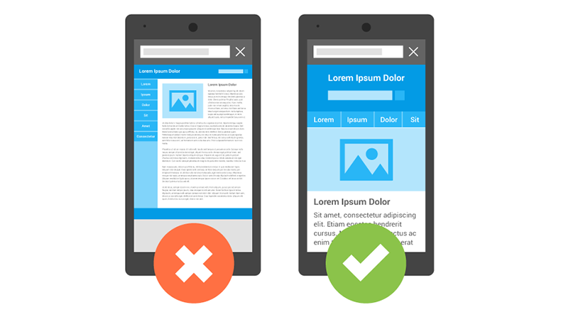
8. Minimize the Amount of Text in Non-textual Elements
Many web designers, who consider themselves great writers, try to make the web application as informative as possible by creating textual labels for literally every graphic element. This is not the right decision. Excess text not only complicates the intuitive perception of the function, it literally "clutters up" the browser window. As a result, there is a high probability that, on smaller screens, the text from one container will overlay with the other. What can you do in this case? Simple. Leave only those strings without which navigating the functionality of the application would be absolutely impossible, namely, button labels and headers.
9. Choose the Right Fonts
Even though large fonts on a smartphone screen may look bad, miniature characters that cannot be distinguished without a magnifying glass would also be ridiculous. Do not create additional problems for your users by forcing them to repeatedly increase fragments of text displayed in a web browser. The other extreme would be cursive and Gothic fonts. You may already have noticed, on sites created by negligent developers, that inscriptions in such fonts, presented on a small scale, look completely unreadable. Choose traditional options (preferably without serifs), which are maximally adapted for visual perception, regardless of scale.
10. Observe Indentation
When creating a responsive design, do not forget to follow the correct indents. For example, indents ranging from 1.25 to 1.5 dots (in the case of distance between columns, this parameter must be 8 dots, at least) will be displayed stably.

11. Employ White-space Attributes
When creating HTML pages, many developers experience the issue that repeated use of spaces in the browser, one by one, will be rendered as a single space (of course, CSS contains a justify text alignment method; however, in some cases, the spaces need to be placed manually). In turn, the <white-space> property automatically distributes the distance between words, working by analogy with <pre>; however, without changing the font to a disproportionate monospace one, unlike the latter.
12. Test your Application on Various Devices
Do not neglect the simulators. Check if your application is correctly displayed in the browser window on varying devices. For the iOS platform, this would be the Apple iOS Simulator. With Android, things are somewhat more complicated because there is a really wide device fragmentation; however, you can try using the Android Virtual Device, included in the Android Development Tools package for Eclipse, and the Android SDK.
13. Make the Pictures Scale Responsively
Of course, high-resolution images that would be displayed equally as clear on both smartphone screens and PC displays may seem a great idea, but it is not the most rational solution for a web application. As a rule, images more than 3 MB in size are loaded into the browser too slowly, which is the easiest way to alienate most of your potential users. Of course, you can resort to using rather complex tools which, incidentally, are not supported by all browsers (here we are talking about <srcset>). Do not reinvent the wheel and use the most primitive solution - set the width to a certain percentage (declared in the <width> parameter) and adapt its height using the ‘auto’ command. Don’t stop there. You can specify the maximum and minimum possible exponent of the width or height of the picture through the ‘if’ condition and the ‘max-‘ and ‘min-‘ prefixes, respectively (for this you will also need the Media Queries tool, which was mentioned in the third tip, above).
14. Employ the Flexbox Tool
Flexbox specification is a real holy grail for layout designers. In order to use this tool, you just need to specify the parameter ‘flex’ in the parent container. In particular, the use of Flexbox provides such advantages as:
- “Rubbery” text containers, which can be compressed and stretched in respect to browser window dimensions.
- Automatic alignment of text elements over the entire width of the window to occupy all the space reserved for them;.
- Full support for locales with both left- and right-sided ways of writing.
Want to Design a Responsive Website, but Have No Idea How to Do It? This Is Not a Problem, We Are Ready to Help!
Applikey Solutions is a team of professional software developers who follow the latest trends in web design. Moreover, we have vast experience in the creation of responsive web design for applications and sites. If you have an idea for a startup, but do not know how to implement it in a web software format, contact us! We will gladly work with you on this new project, and guarantee that our results will meet your expectations. To contact us, simply fill out this form. Our experts will be in touch as soon as possible to discuss your project.


