Whether you are designing a website or developing an app, you should always keep in mind that animation has become an integral part of an interface. It is practically impossible to find a digital product that does not have any animations on board. You will see at least one or two animations on any website or application because they make things more appealing for the audience. We all can agree that in the past animation was mostly utilized to add a few extra points of visual luxury to a product, but today it is a technical requirement. Users expect to see it, and you should not disappoint them. From the developers’ standpoint, the animation is a sort of wild card that can be used to cover various functional holes within a product.
Smart use of animations can make any UI look livelier in comparison with its static version. It also takes responsiveness on a completely new level, which is crucial for mobile apps that must be appealing and provide an engaging user experience. Without any notable features that make your application stand out, it is highly unlikely that users will notice your project on a crowded market. We don’t mean that animation is the key to success, of course, but rather an opportunity that should not be neglected. When done right, animations can attract users’ attention, improve their experience, and reduce cognitive load. And today, we’re going to explain how you should use this instrument, review the key principles, and talk about the most popular types of animation for mobile apps.
How Is Animation Used in Mobile Applications?
The discipline that rules and determines the use of animations is called motion design. It has come to the IT sphere and app development from the filmmaking field, and now it serves one main purpose – improve the usability and make digital products noticeable. With the help of animations, designers can do the following things:
- Show users how interface parts are connected.
- Highlight the most important elements/options.
- Guide user’s attention,
- Explain the hierarchy of screens within an app.
- Explain what’s happening on the screen at the moment.
The most popular usability enhancers that proved their efficiency are progress bars, click effects, list bounces, and hover effects. Smart motion design makes a UI predictable, more convenient, easier to navigate through, and simplifies interaction with particular elements. In addition to that, the addition of smooth and loveable animations makes UX more memorable. When implementing animations, remember that excessive use of them might be just as bad as their deficiency. Keep the balance and apply animations only when they can improve your product. The impression your app makes on people determines are they going to use it again or switch to another program.
Why You Need Animation?
Having good-looking visual effects and a user-friendly interface is not enough to rise above your competitors, especially if they have been out for a long time and have accumulated high numbers of customers. Without animation, even a well-thought-out interface might seem intricate for some people, thus making them feel they perform actions without a context.
Well-made animations make app design more pleasant and sleek. Linking animations to audio and tactile responses is a common practice that makes the user experience more tangible and realistic, thus reducing the level of cognitive load. When a user receives “feedback” from the app right after a certain action, the brain remembers all connections within an application faster and spends less time to learn the context.
Context and user guidance are important for any mobile app because users don’t know the product and don’t see it as its developers do. Animations can redirect their attention from one screen to another, even if those screens are not interconnected. This way, no user will feel lost when navigating through your application.
Main Principles of Animation for Mobile Apps
We already mentioned that you should know your limits when tinkering with animations, so it would be appropriate to explain the basic principles of implementing animation in mobile apps as well.
- Restraint is a key factor in making the most out of the animations you’re integrating. Don’t get carried away and don’t get tempted to animate everything on the screen because it will negate the value of adding elements of motion design.
- The use of sequences is important to bring order and strict hierarchy between animations. If you allow all elements on the screen to twitch, jump, or move, you will anger your audience. It is like having a group of people in a room talking to each other at the same time. So, if you really need to add visual effects to multiple elements on one screen, don’t forget to separate those effects with a short delay. Also, keep in mind that all motions should have the same duration and easing to make everything look consistent. For quick but still noticeable animations, you should make the interval not longer than 20ms between animated elements.
- Speed defines the perception of your animations. Animation speed is usually managed by setting the duration of visual effects (how long it takes to switch from one screen to another) and easing (specifies the rate of changing). The duration of the animation can affect the entire user experience. Motion designers recommend using animations up to one second long. Animations shorter than one-third of a second are practically unnoticeable; thus, users are highly likely to miss them. Or even worse: they will notice that they have missed something, which might be confusing and provoke anxiety. Long animations are not a panacea, though. Everything longer than one second will look too slow and needlessly complicate interactions with your app.
- When animating, be realistic and don’t ignore simple laws of physics people got used to seeing in the real world. Any motion requires time to speed up and slow down – no movement happens instantly. The more natural your animation looks, the better. It lessens the cognitive load on users, so they will understand what it does faster. With proper animations, your app will be closer to the real world instead of the abstract, digital one.
- Link all your animations and interactions together. Animation in mobile apps usually starts in two scenarios: during/after the loading screen and when users interact with the interface with gestures like swiping, touching, or dragging. The type of interaction determines the animation type to be played. For instance, if a user swipes up the screen, the application will launch a visual effect with a slide animation from the bottom to the top. When designing and applying animations in your apps, always think about different interactions triggered by these animations.
Types of Animations
In order to use animations properly in your app, you need to know their types and understand how they work before applying. We picked the six most popular types of animations used in various mobile applications.
Visual feedback
Every good UI needs visual feedback. When we interact with something in the real world, we expect certain things to happen according to our previous experience. App elements must be responsive as well to let users know that they are in control of the situation at any given moment. Also, when someone taps a button, and it does not react visually, it might seem like the app is not working properly. Just adding a sliding motion or quick button shiver is enough to tell users that your application is working on something and that the user’s input is being processed. This type of animation is used in the popular dating app – Tinder – where users do swipes to left or right to “Like” someone or “Pass.” Check the animation example below, where simple box-checking for the completed task is supported by shrinking and re-coloring:
Navigation animations
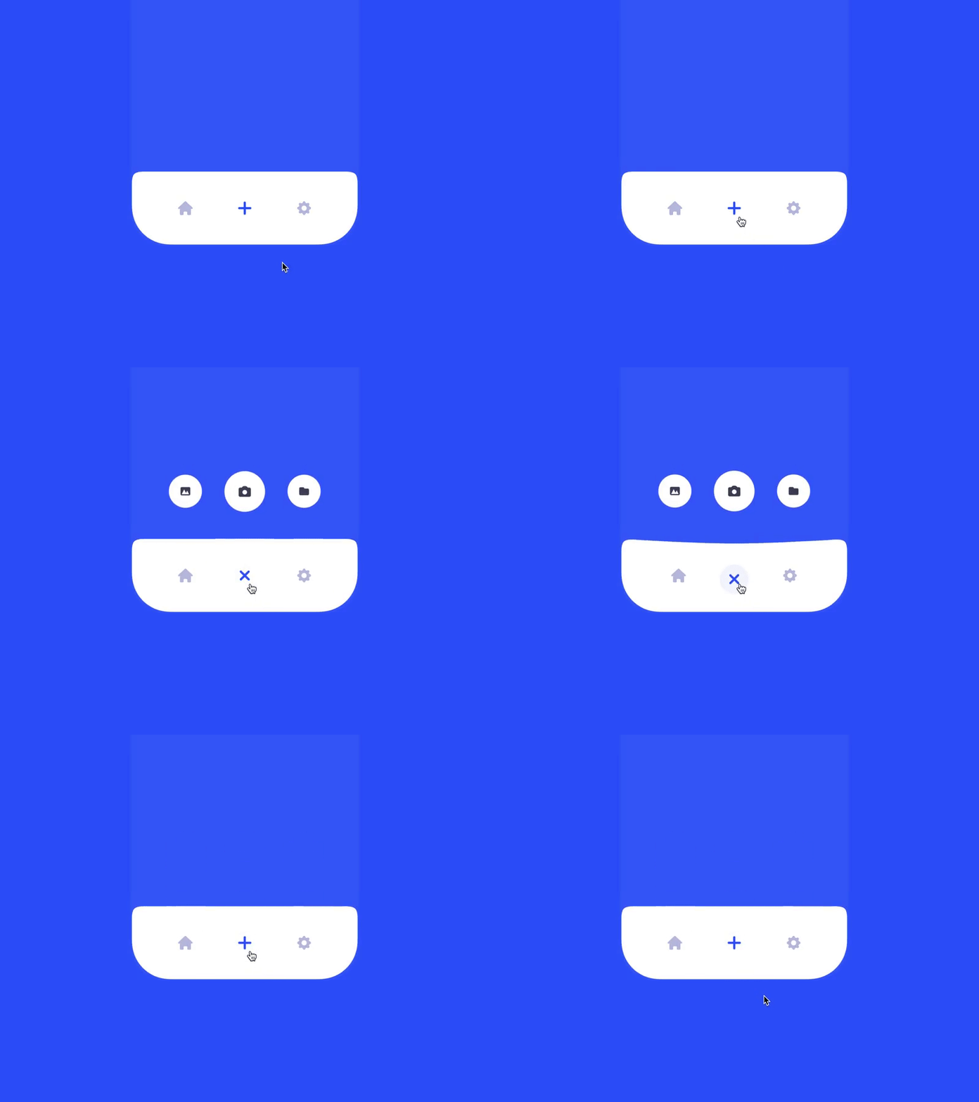
People love to see how their actions change elements of a UI within an app. These animations is the way to go if you want to explain to users what happened after they activated something. For various small elements of UI, including buttons and icons, designers often rely on navigation animation. With these animations, you can also hide functions that can be accessed at any time, but they are invisible on the main screen by default. In our example, you can see that there is just one button in the lower-right corner that “hides” three additional options:
Orientation change
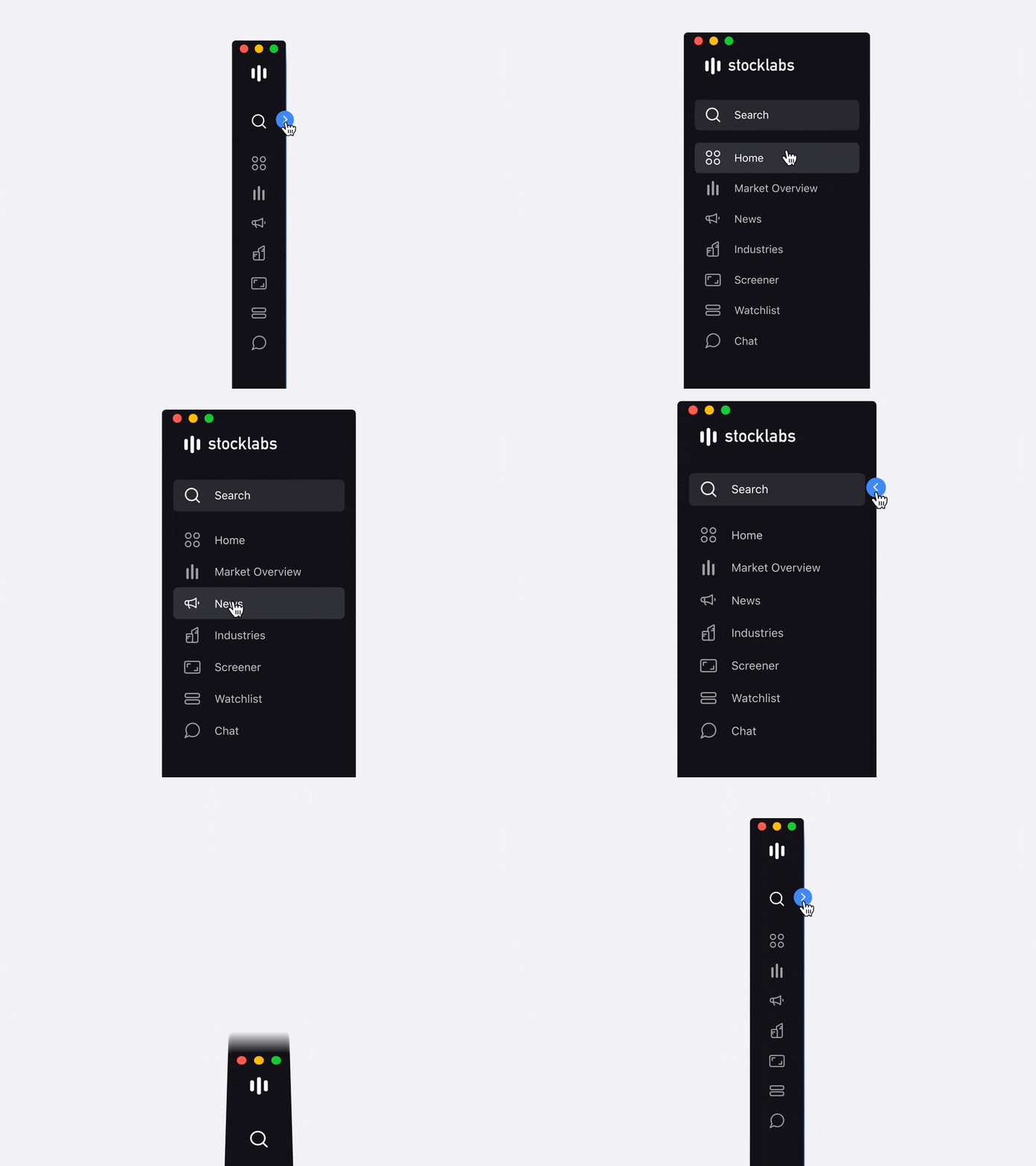
Most professional applications have one thing in common – their structures are very complex. Clever designers know some tricks that can simplify navigation in such difficult digital environments. One of them is providing visual clues with orientation. When you close a submenu, and then it shifts into a horizontal position only to roll upward, you will remember where to find that particular menu next time. Here is an example with a moving navigation bar that changes its orientation after closing:
Progress animation
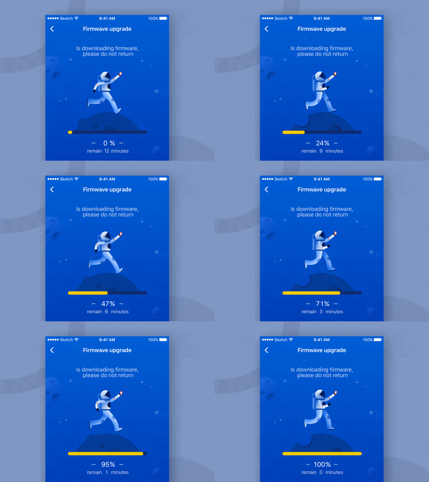
Some apps have features that take time. You cannot ask a travel application, for instance, to build a route immediately after selecting two points on the map. It may take a few seconds or maybe up to a minute, depending on the complexity of available options. To save a user from stress while waiting, the app needs a tool that will be indicating that everything is okay. Applying a progress bar or status animation is a perfect solution for this problem. People are familiar with such animations because everyone downloads files or waits for heavy programs to load their components. Having a progress animation calms down impatient users, letting them know that their request is being processed and that the results will be available shortly.
Visual prompts
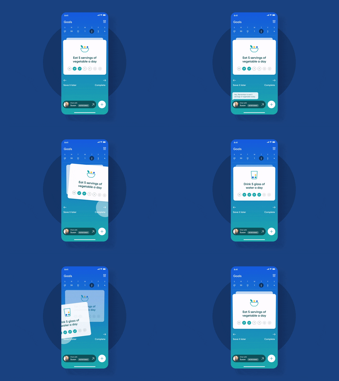
If your app has a preview function, then it would be wise to make it look more appealing with some animations. Visual prompts are an absolute must for apps that use gestures as the main means of control (remember Tinder?). Buttons without captions may look confusing, but adding a pop-up explaining them solves the problem effortlessly. Some user interfaces have zero buttons, which can be difficult for new users that expect guidance, so you must provide visual hints. Any UI element that is not obvious should have visual cues, especially if you use unpredictable interaction patterns in your app. Check how new hints pop-out with this animation:
Animated transitions
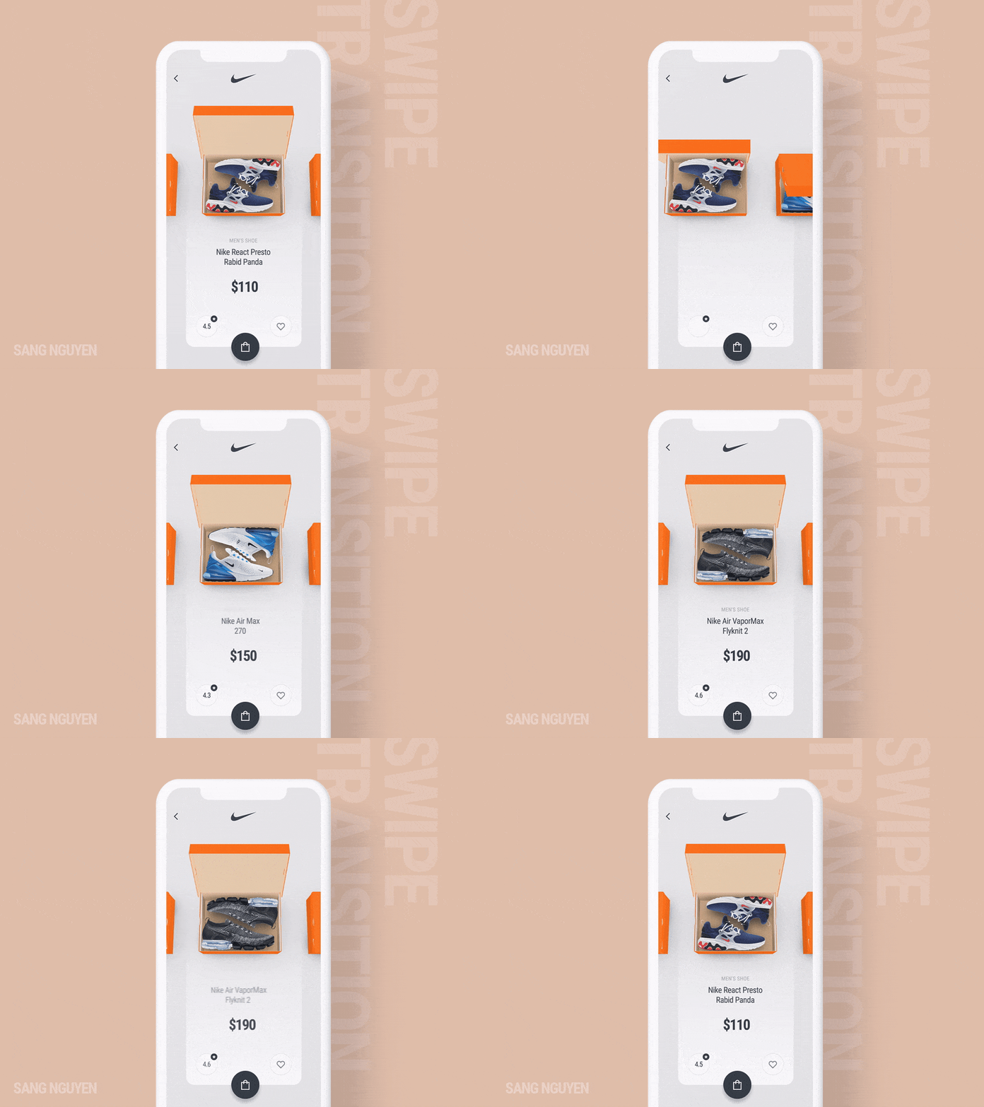
Probably one of the oldest tricks in the book of motion design. Maybe not that old but certainly not a new one. Smooth transitions are always fun to interact with, whether you’re shopping online or reading a book. The best transitions copy trivial actions from the physical world – like turning a page – and enhance them with cool visual effects within an application. Creative transitions make your app memorable and pleasant to work with. Another benefit of this type of animations is to map out a way for users, so they will never get lost, remembering how they got to the current position. Transitions between UI elements or separate screens make your app look clean, less overloaded.
Splash screen animations
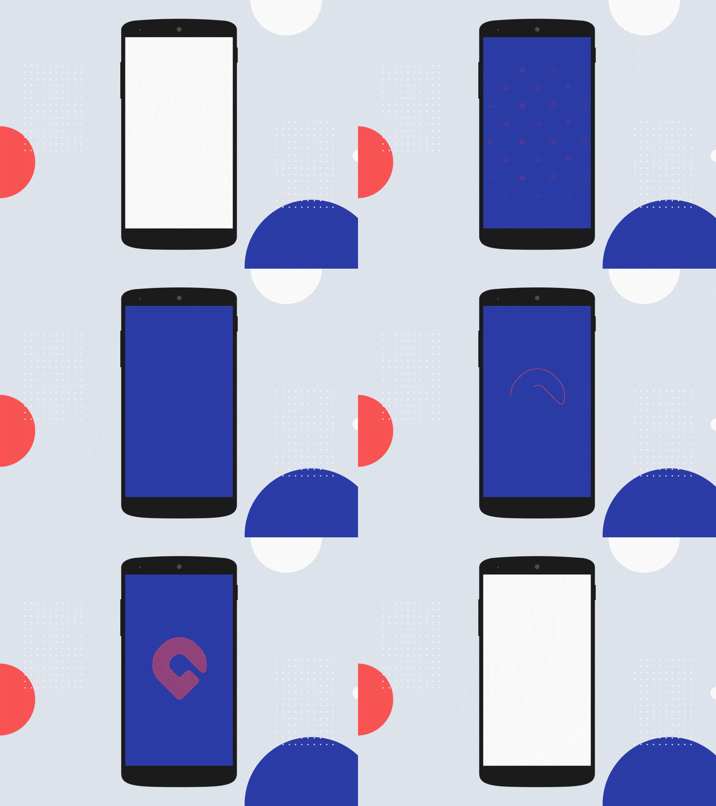
The first thing a user sees after launching a well-designed app is usually a splash screen animation with the app’s logo or company name. Splash screens are popular in heavy apps that cannot be loaded instantly. Developers use this animation to distract the user’s mind while the app is starting. This is an entertainment feature without any technical elements, not a very obvious loading screen, if you want. When users are watching a cool, welcoming animation, they forget about time. In addition to that, splash screens can be used to make the first impression and point out one main advantage of using this app. But it requires a subtle approach in order not to scare off potential clients with a premature advertisement, so only indirect hints are allowed.
Fun animations
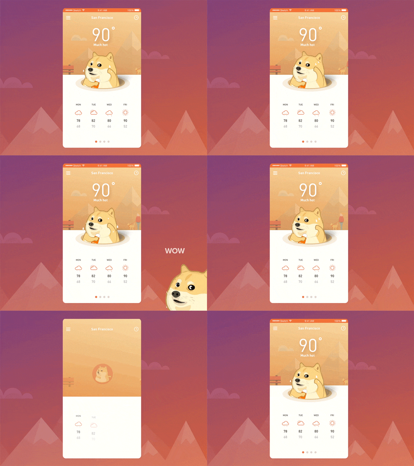
These animations are tricky to work with because they can be inappropriate in many scenarios. Plus, if you are applying them carelessly, just “because I want,” it may result in many complications during the app development stage. However, truly unique and original animations win users’ attention and make them fall in love with your product. When you are thinking about implementing fun animations, keep in mind two things. Firstly, the designing process must not take a lot of time since it is not the main feature of your app but just a cool addition. Secondly, you need to make sure that your fun animations don’t block functional features and don’t overlap with other animations. These animations bring the aspect of gamification to your product, and people of all ages do love games. On the animation example below, the addition of Shiba Inu is completely unnecessary, but it makes the boring weather forecast look so much livelier:
Conclusion
Now you have come to realize that animation is one of the key elements for creating an outstanding user experience. If you are building your own mobile app, start thinking about animations and interactions from the very beginning. This will allow you to focus on enhancing the UX during the development stage. The principles of animations described in this article are tested and proved to be efficient, while trending types of animations may (and most likely will) change over time.
We can only encourage you to experiment with animations in your iOS and Android applications. And if you need an expert opinion from seasoned developers and designers or just have any questions about applying animations in your app – don’t hesitate to contact us! Here, at Applikey, we’re always happy to help you!


