The application icon is a kind of logo that is displayed on a user's device, as well as in the Google Play or App Store markets. It is often the case that developers pay too little attention to the art of designing icons for mobile apps, considering that the graphic design icon is less important and significant than the application’s functionality itself. In this regard, we can say only one thing: the mobile app icon design is not just a picture, but it is also the application logo. The icon is associated with your product, both on mobile gadgets and in application stores.
How important is the logo? Well, let's look at any large and well-known company and their branding. This process (which is essentially a creation of the company’s logo) for many large corporations and manufacturers bears a high price. The question arises: if the custom logo is not important, then why do company executives spend a lot of money on its creation?
The answer is simple: a logo is not only a picture that unambiguously associates a product or service with a certain manufacturer; it is also the image of the company. A successful logo attracts the buyer's attention to the product, and a good app icon design can become a decisive factor for the user, influencing their choice in the application catalog. For a startup, this may be a choice between oblivion and explosive success.
That is why the icon is exactly the same essential part of the application as its user interface or business logic and it is necessary to approach its design as responsibly as the development of other elements. How to design an app icon?
Icon Design: Useful Tips
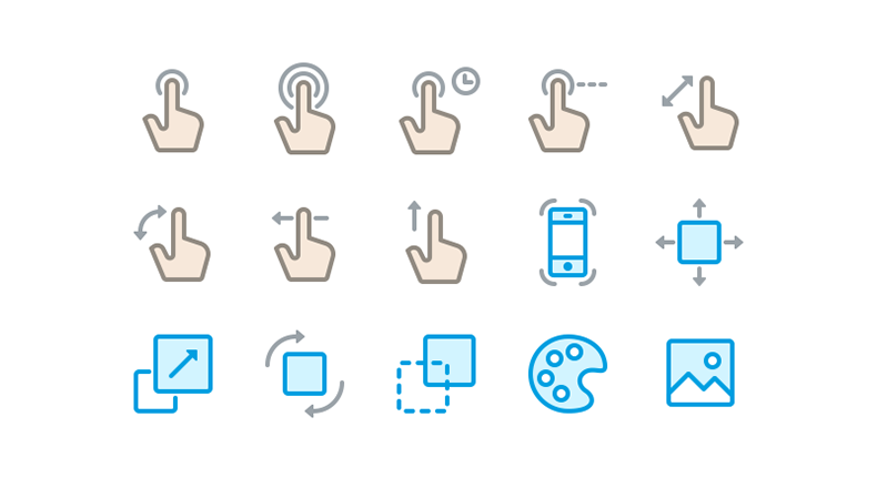
Having understood the significance of custom icon designs for applications, as a whole, as well as the basic functions, it is worthwhile to determine how this element should fully implement them. In order to attract the user's attention and not be lost among other products, the icon should:
- Be bright;
- Be memorable;
- Give an overview of the application functions, at a glance;
- Be uniquely associated with the application.
The following 11 tips to design an app icon, will help designers achieve the desired result in their end products.
1. Targeted Visual Environment Features
The icon for your product should stand out among others, but still look harmonious next to them. In addition, when designing mobile app icons, it is important to consider the common interface guidelines of the target platform. The logo of your product should be bright, though not outstandingly so, as compared to the general design of the app market or the visual tools of the mobile OS. Icons for Android and iOS devices such as iPhone and Pixel should differ from each other in style, in the same way the interfaces of these systems vary from each other.
2. Main Audience Specifics
Using various signs and glyphs in icon design, make sure that all representatives and audiences of your product will equally perceive and interpret their meaning. This point is especially important for products situated to international markets. Remember, the same symbols and combinations of colors can cause absolutely different reactions among residents of different countries. Make sure that your icon will be understood by all potential users and will not offend anyone.

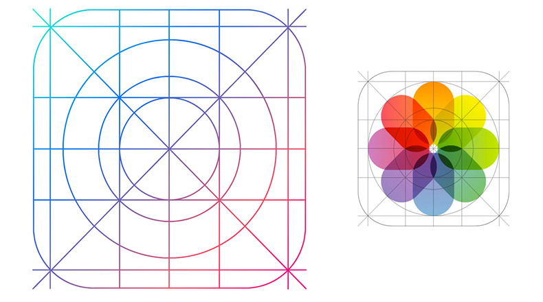
3. Size
A picture, which may look great on a designer’s monitor of a specific size, may not remain the same when reduced to the resolution of an icon. This is another point to consider when designing the logo for the program.
4. Details
Creating a large number of details when developing an icon is likely a meaningless task as, after the resize, these details would not only have limited visibility but are also likely to spoil the appearance of the logo. Minimalism is the best and most logical solution for icons.
5. Universal Design
Remember that, in the future, the application icon will be located on the user's desktop. This part of the environment interface can be absolutely anything, as it is selected and configured by the user. Your icon should be noticeable on both dark and light backgrounds and match the existing color scheme as much as possible.
6. Light, Shadows, and Perspective
At first glance, it may seem that these graphic elements are not relevant to the application icon; however, everything is actually quite the reverse. Elements such as shadow, imitation of light rays, or volume can make a simple bi-color drawing interesting. In fact, with a minimalistic icon design, only these elements are able to make it original. Nevertheless, you should not get carried away with shadow and perspective. Remember: with a finite-sized icon, many little things will simply become indistinguishable.

7. Form
The original shape is another way to ensure that the logo of your product stands out among hundreds of others. On the Android platform, the icon itself does not have to be a simple square, but do not complicate the form too much - it can damage the overall appearance. When playing with the form of the logo, do not forget that it should still look harmonious next to other applications.

8. Color Spectrum
Choosing basic icon colors is one of the most important and complex tasks. In addition to the fact that all the colors of the software should fit well together, it is important to make sure that you do not use too many different colors. The optimal solution is to use two, maximum three, colors, increasing the color variation due to the light and shadow imitation. Wide color variety in one small icon can turn it into an incomprehensible set of motley pixels.
9. Caption
Using the application name in the drawing of an icon is a simple and very tempting move; however, the final size of the icon is an important limiter for the text component (same as with other design elements).
If the application name does not consist of three or fewer letters, then it’s likely that the user will not be able to read it. Use the abbreviation in the logo or the first letter of the application name, instead.
10. Signs and Glyphs
An excellent solution would be to convey the basic functionality of the application with simple and understandable signs. If the user, just by looking at the logo of the program, can immediately understand its functions and capabilities, even before reading its description, then the icon design is really strong. You should not, however, try to transfer absolutely all the features of the application to the logo - for this, there is a responsive interface. The best solution always includes minimal details and universal icons that are understandable and clear for the audience of the product.

11. Study the Competitors
The study of competitor product icons in the design is as necessary as the study of their main functionality when creating your application. If the logo of your application can be confused with a competitor's product (because of the similar graphic elements or colors), then your development may be perceived as an attempt to create "something similar to X." Such associations are likely to have a negative impact on the number of downloads of your application.
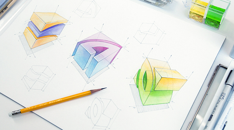
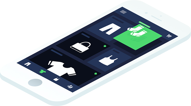
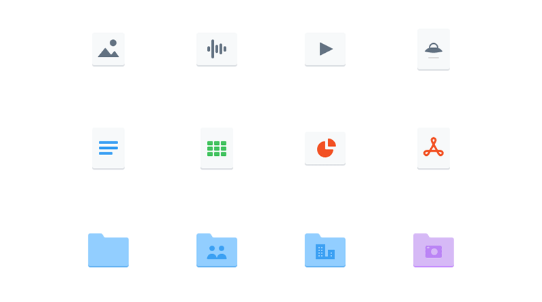
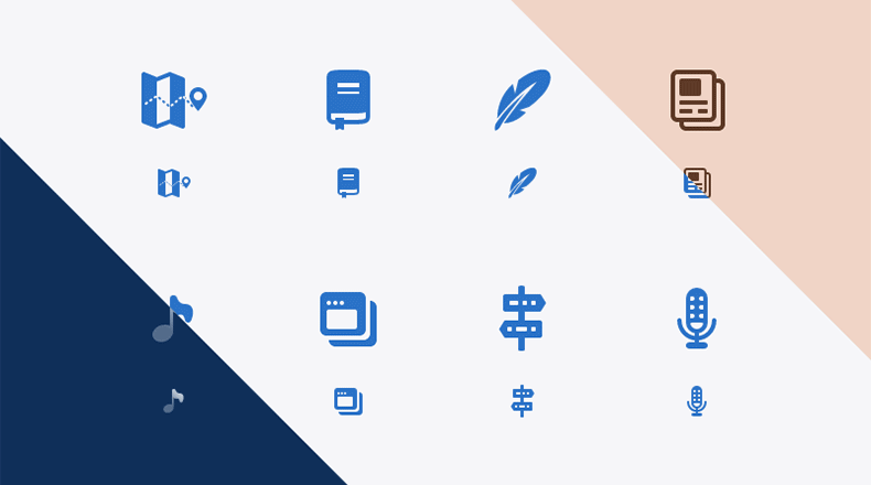
Examples of our Work
Here are a few examples of works built by our designers that illustrate the above tips.


What else should I know about icon design?
The application icon design is the case where creating something seemingly small and simple is actually a very complex process. An ideal icon should combine a number of non-connectible at first glance qualities: be bright and noticeable but complacent with platform design guidelines, be as informative as possible with minimal details, be understandable to the audience, and be compatible with the various colors of the visual environment. Most importantly - the icon should be original and unique.
Learning how to design a mobile app icon, and developing icon designer skills, one should devote a lot of time not only for practice and experiments but also to studying the ideas of other designers. Remember that talent and professionalism are the results of many hours of hard work.


